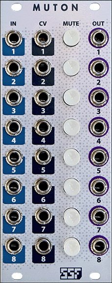
Please put the mute buttons on the right side of the outputs.


In case they don't consider it an opportunity to get more ambidextrous ;-)


In case they don't consider it an opportunity to get more ambidextrous ;-)
-- wiggler55550

Just a strange way of doing a mute button:)


How would have you done it?


when I designed the Schleußig module, I asked people (muffwiggler) what they think about my prototype (which looked a lot like this) and the suggestions I received went into the final layout I have now: connectors on top, buttons below.
I am happy I asked before bringing it into the market


when I designed the Schleußig module, I asked people (muffwiggler) what they think about my prototype (which looked a lot like this) and the suggestions I received went into the final layout I have now: connectors on top, buttons below.
I am happy I asked before bringing it into the market

-- lpzw_modules

Happened to test multiple configurations as well.
Works very well in this configuration and no issues reaching the mute buttons - happy to hear you came up with your own design... none of them are perfect.


I was in favour of the "row" design too. I thought it would represent the signal flow better but I was convinced by the good folks on Muffwiggler to take the other route.
No critique or so, I was just saying that I have heard those request too.


I think the layout is good. If the sources come from the left and the outputs go to the right, a "valley" will be created down the centre to allow easy access to the mutes. I suppose if mounting the middle in the far right of a case it might be preferable for outputs to go back to the left but I can't see how either option will please everyone.


Why is it discontinued? :(


Please bring this module back to life. I have one and would love to have another one.